Mainstream Social Analytics Tools Just Repackage the Dashboard Already Free on Your Phone
Most social media analytics tools charge a subscription for numbers your free native dashboard already shows. None of them answer the only question that matters: why your content works, and what to make next.
May 19, 2026
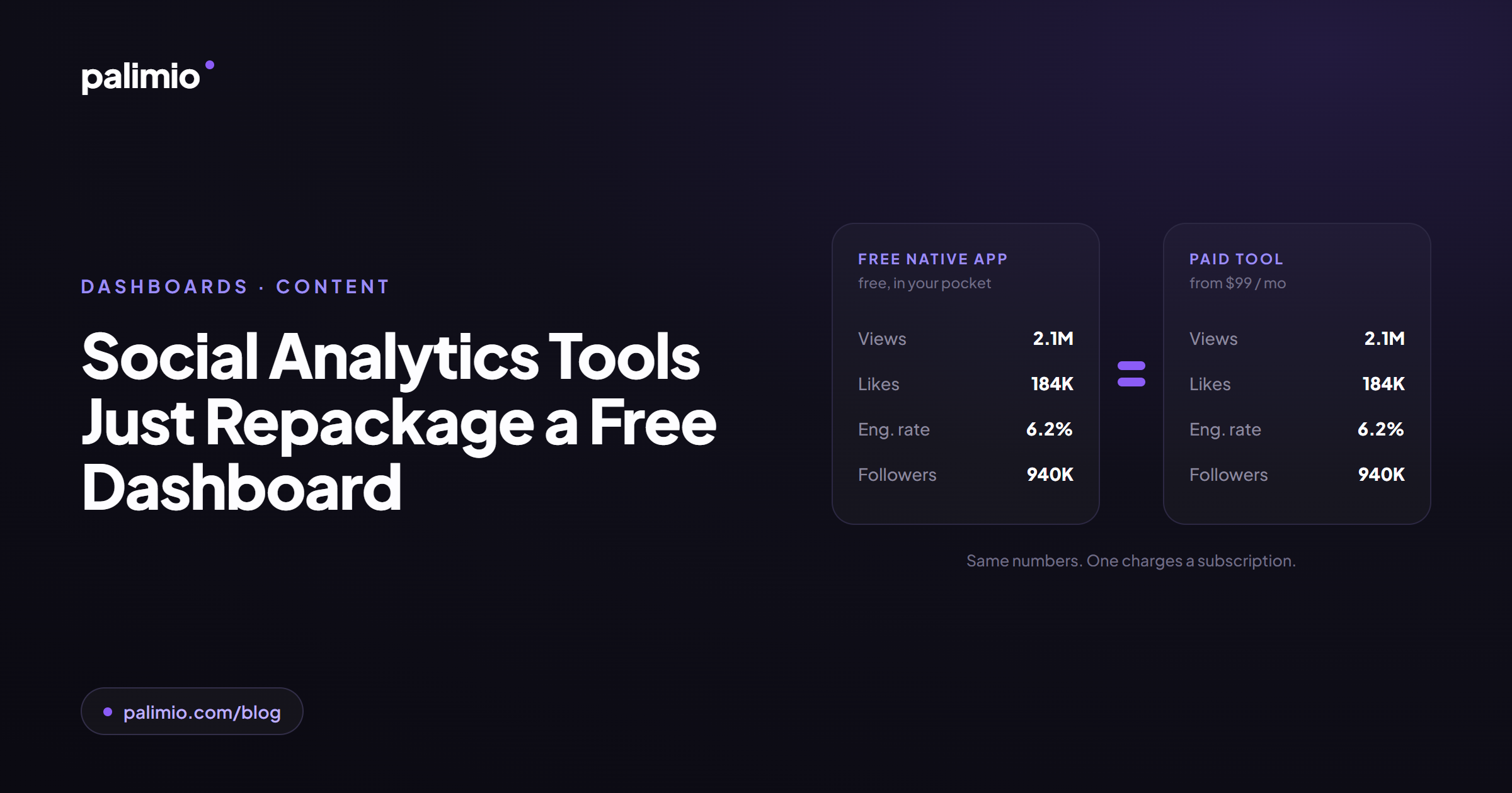
Here is an uncomfortable claim for an industry worth billions: most social media analytics tools do not tell you anything your free native dashboard does not already tell you. They report the same numbers in a different layout, add scheduling and team workflows, and charge a subscription for it. They are operations software sold as insight software.
This post goes through exactly what Hootsuite, Sprout Social and Rival IQ provide, why it is not enough, and what reading the actual content of a feed looks like instead, using real TikTok and Instagram data from @nytimes, @duolingo, @gymshark and @ryanair.
Your free native dashboard already does the expensive part
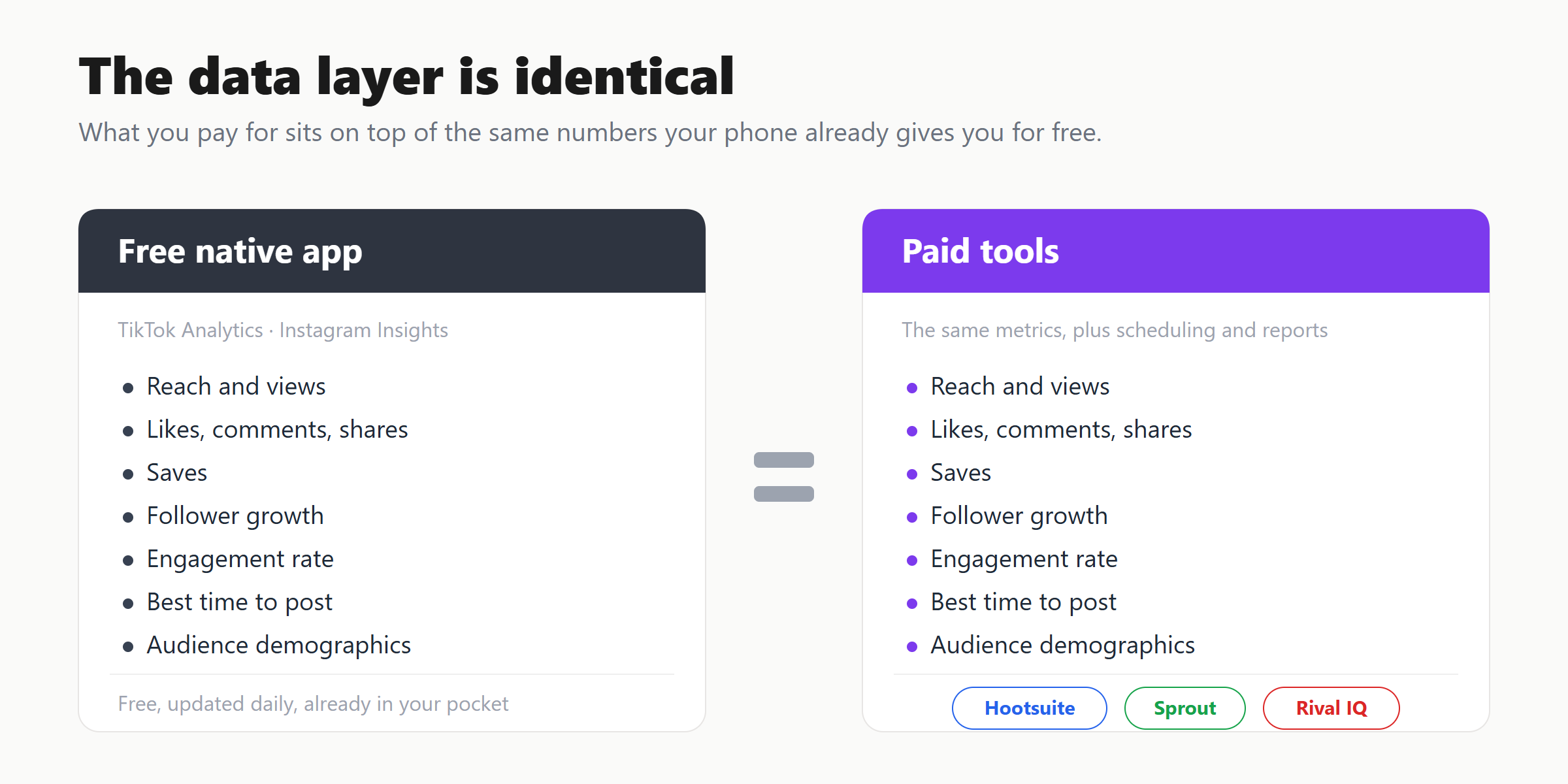
Open TikTok Analytics or Instagram Insights right now. For free, both already give you: views and reach, likes, comments, shares and saves, follower growth, audience demographics, the hours your audience is active, retention and average watch time, and traffic source. TikTok will compute your TikTok engagement rate for you. Instagram will show your Instagram engagement rate, reach and follows per post.
That is the data layer. It is already in your pocket, updated daily, at no cost. Any tool that wants your money has to add something on top of that. So the real question is not "what do social media analytics tools show you". It is "what do they show you that the free dashboard does not". Go tool by tool and the honest answer is: surprisingly little, and almost none of it about your content.
What Hootsuite, Sprout Social and Rival IQ actually provide
Hootsuite is a scheduling product with reporting attached. Its analytics aggregate reach, impressions and engagement across your networks, blend organic and paid, suggest best times to post, and build branded client reports. Useful if you run ten accounts and a calendar. But every metric is one the native app already gave you, summed and styled. The value is the calendar, not the insight.
Sprout Social is the same shape, plus social listening: keyword volume, sentiment, share of voice, competitor follower and posting reports. Its tag-based reporting sounds like content analysis until the fine print: you create the tags and apply them by hand, post by post. It is a spreadsheet with a nicer interface. The tool is not reading anything. You are.
Rival IQ is the most serious of the three, and the most honest: it is a benchmarking tool. It pulls public profiles, computes engagement rate by follower and by view, ranks top posts, and runs head-to-head competitive landscapes. Real analysis, but look at its unit: the post as a row, labelled by media type, hashtag or keyword. It will tell you "video outperforms images by 32%", not that your scripted-comedy format out-engages your product demos two to one, because it does not know what that format is. Nothing in its data model describes what is in the video.
Put the whole category on one grid and the pattern is obvious. Everything to the left of Palimio answers one question: what happened. How many views, how many likes, what your engagement rate was, which post won, how you rank on follower count against a competitor. These are counts and rankings of outcomes. None of them answer the question every creator and strategist actually has on a Monday morning: what should I make next, and why.
"What happened" is not the insight. "Why" is.
A view count is a result. An engagement rate is a result. "Your top post got 2.1M" is a result. Knowing the result does not tell you which creative decision produced it, and the creative decision is the only thing you actually control. You do not choose your view count. You choose the format, the hook, the topic, the tone, the setting and the production technique. Those six choices are the levers. Every mainstream tool measures the outcome and ignores the levers, because reading the levers means watching the video, not counting the clicks.
That is the entire gap. Native dashboards and paid tools both stop at the outcome. The thing nobody in the category does is read the content itself and connect the creative decision to the result at scale. That is the only job Palimio does.
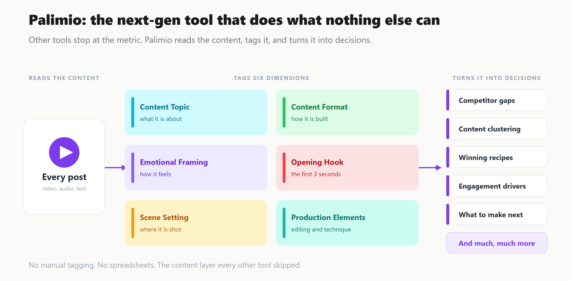
What Palimio does
You connect a TikTok or Instagram handle. Palimio ingests the entire post catalogue, not a sample, and runs every post through multimodal AI that actually watches the video, listens to the audio, reads the on-screen text and the caption. Every post is tagged across six creative dimensions: format, topic, tone, hook, scene and setting, and production technique. Competitors are tagged on the same shared vocabulary, so you are comparing content to content, not follower count to follower count.
Then it runs real statistics on top of those tags: median views and engagement-rate distributions per format, per topic and per hook, correlations between every engagement signal and reach, comments per ten thousand views, date-range splits, a controversy score, and a plain-English insight for each breakdown. The output is not "your engagement rate was 6%". It is "this format is your highest-engagement format, you publish it least, and here is the gap". It is a content strategy engine, not a reporting dashboard. Here is what that surfaces on real accounts.
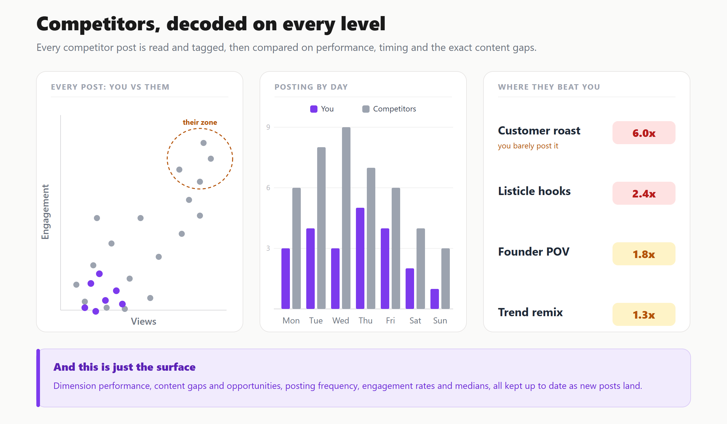
Use case 1: Ryanair's reach lives in the levers, not the format
Take Ryanair, and ignore format and topic entirely. 378 TikToks, a 162,600 account median. Every signal that matters here is in how a video is framed and opened, not what it is about.
Start with emotional framing. Humour is the whole brand: 318 of 378 posts are tagged Humorous and pull a 180,300 median. The 17 posts where Ryanair goes Informative instead do 114,400 at a 3.0% engagement rate, its weakest tone on both counts. The moment Ryanair stops being funny, reach drops by a third.
The opening hook tells the same story in another language. Videos that open on text-on-screen, 262 of them, do a 188,600 median. Videos that open visual-only, with no words in the first three seconds, do 91,900, less than half. Ryanair opens most videos the right way already, but the one in ten that opens cold pays for it.
Then the two levers no format report could ever surface. Posts built around a social-media screenshot, a production choice, do a 473,800 median, almost three times the account, at the highest engagement rate on the channel. And emotional risk: the 108 posts with a mild edge do a 475,300 median, while the 211 genuinely safe ones do 136,100. Ryanair plays it safe 56% of the time, and safe is its lowest-reach setting.
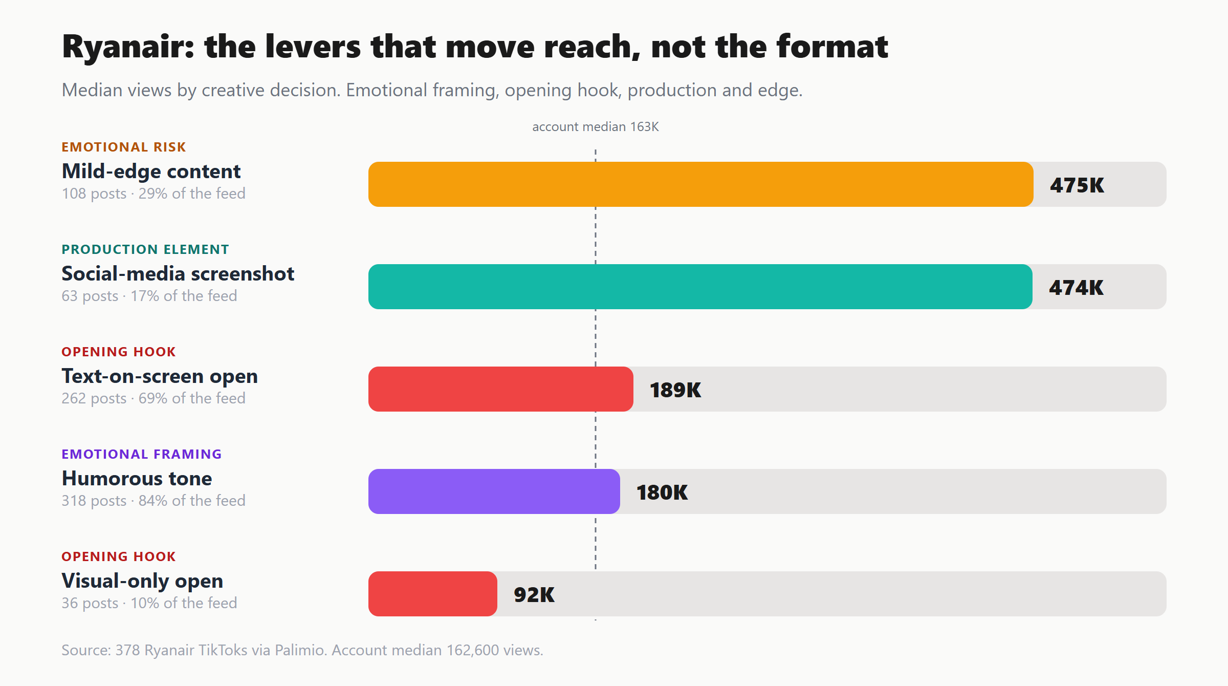
None of that is a format finding. It is tone, hook, production and edge, four dimensions a metrics tool cannot see and a format-only analysis would walk straight past. Read together they say one thing: Ryanair's reach is an emotional-decision story, not an editorial one.
Use case 2: The New York Times publishes its weakest format the most
We ran 300 New York Times TikToks through Palimio. The account median is 41,300 views at a 5.1% TikTok engagement rate. Standard tools stop there. Palimio breaks it down by format and the strategy problem is immediate.
The News package, a straight broadcast-style summary, is 223 of 300 posts. Three-quarters of everything they make. It does a 42,800 median, almost exactly the account average. Meanwhile the Investigative report format is just 10 posts and pulls a 407,600 median, roughly ten times the workhorse. The Graphic-led explainer, 18 posts, does 131,500 at a 7.6% engagement rate, the highest on the account.
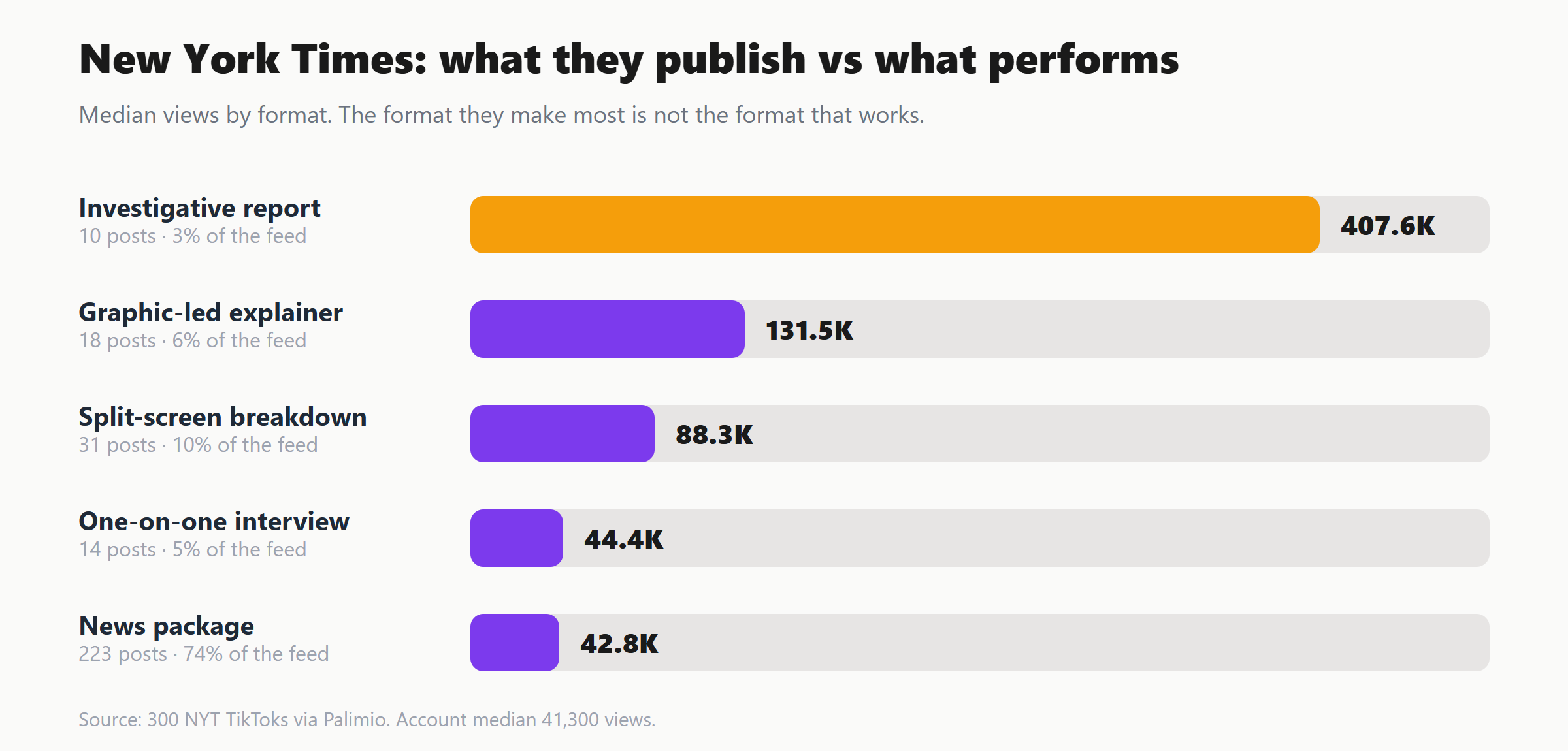
No metric tool can produce that sentence, because "News package" and "Investigative report" are not metrics. They are content. Rival IQ would show you the top investigative post as a high-performing row. It would not tell you the format as a class returns 10x and you allocate it 3% of your calendar. That is a content strategy finding, and it only exists if something read the 300 videos.
And this is a single cut of a single dimension. Palimio runs the same breakdown across all six creative dimensions, format, topic, tone, hook, scene and setting, and production technique, then layers on engagement-rate distributions, correlations, comments per ten thousand views, a controversy score and date-range splits, with a plain-English insight for each. The format finding above is one line from a far deeper read.
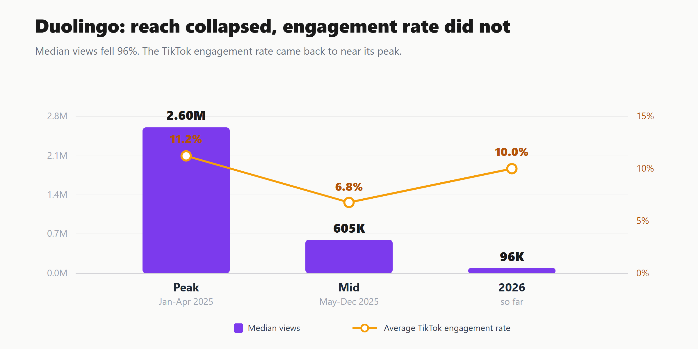
Use case 3: Duolingo's reach collapsed and its engagement rate did not
This is the example that breaks metric tools completely. We ran Duolingo's full 450-post catalogue and split it into three eras: the January to April 2025 peak, the mid-2025 break, and the 2026 rebuild.
The headline numbers look like a brand in freefall. Peak median: 2.6M views at an 11.2% engagement rate. Break: 604k. Rebuild: 95,900, a 96% collapse in reach. On any native dashboard or Rival IQ chart that is the whole story, and the story is panic.
Read the format breakdown and the collapse has a cause. At peak, every winning format had the mascot at its centre: Mascot Product Demo did a 4.9M median, Humorous Meme Overlay 3.2M, Mascot Dance Routine 2.8M. By the rebuild the mascot is a supporting act, not the lead. Mascot Dance Routine is still the most-published format but does just 95k, while the formats now carrying the account are the Long Carousel at 205k and the App UI Lesson Screenshot at 129k. The format mix did not just shrink, it inverted.
The topic breakdown shows the same pivot. At peak, Brand Humour was the engine: a 3.1M median over 53 posts, with a handful of Product Promotion posts spiking to 7.5M. In the rebuild, Language Learning is the largest topic at a third of all posts and a 126k median, ahead of Brand Humour at 74k. Duolingo quietly rebuilt itself from a comedy account that taught languages into a language account that is funny.
The third layer is the one a metric tool does not miss, but actively misreads. In the break era two posts went enormous: an office dance sequence at 111.5M views and a "6-7" meme sketch at 102.1M. A dashboard files those as the best month in company history. Their engagement rates were 0.9% and 0.4%. That is reach without resonance, an algorithmic push to people who watched once and felt nothing. Strip the hollow spikes out and the audience that stayed is as engaged as it ever was: peak 11.2%, rebuild 9.97%. The account was never dying. It lost a viral-era reach subsidy and normalised onto a smaller, stickier base, the exact opposite of what the view-count line screams. You only reach that conclusion by reading format, topic and engagement rate against each other over time, which is a Palimio breakdown and nobody else's.
Use case 4: Gymshark's most-used format is its lowest-engagement format
Gymshark, 280 posts, a healthy 357k median and a 10.8% engagement rate. A metric tool says "great account" and moves on. Palimio's format breakdown says something more useful.
The Workout Montage is Gymshark's most-published format, 104 posts, more than a third of the feed. It does a 9.9% engagement rate, the lowest of any format with real volume. The Short Carousel, published less than half as often at 42 posts, does a 12.2% engagement rate and a higher median. The Motivational Monologue, 65 posts, does 12.0%.
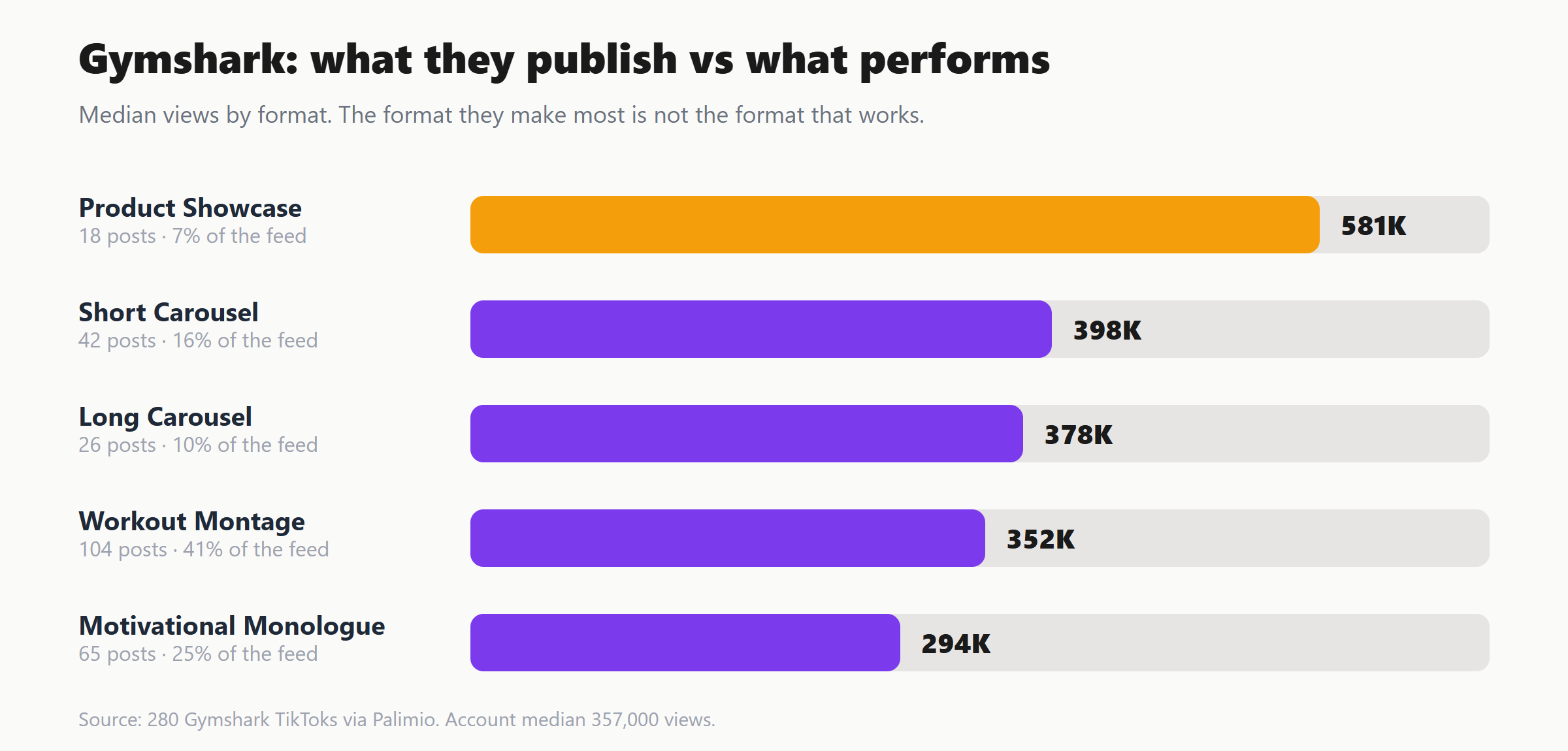
Gymshark is pouring the most resource into its weakest-engaging format and under-using the two that beat it. That is a concrete, defensible reallocation decision. It is invisible to every tool that treats a post as a row of numbers instead of a piece of content.
Four major accounts. The same finding every time: each one is systematically under-publishing its strongest content and over-publishing an average one, and not one of them can see it through a mainstream analytics tool, because none of those tools read content. They count it.
Why this is different, in one line
Every other tool in the category, free or paid, has the same unit of analysis: the metric. Palimio's unit of analysis is the creative decision. That is the whole difference. The mainstream tools are a very expensive way to re-read the dashboard that is already free on your phone. If your actual question is "what should we make next", they cannot help you, because they never looked at what you made.
That is not a knock on running a content calendar in Hootsuite or benchmarking followers in Rival IQ. Use them for what they are good at. Just stop expecting a metrics aggregator to give you a content strategy. It does not have your content. It only has your numbers, and you already had those.
This is what Palimio does
Every breakdown above came from one command: connect a TikTok or Instagram handle, let Palimio tag the entire catalogue across format, topic, tone, hook, setting and production, run real statistics on the patterns, and read it back in plain English. No tagging spreadsheet, no manual coding, no six-figure contract. It is the content-level layer the rest of the category skipped.
If you run a brand, agency or creator business and want to see what is actually driving your reach and engagement rate, not just what it was, drop us a message and we will run your account through it.